
The beautiful spring came; and when Nature resumes her loveliness, the human soul is apt to revive also. –Harriet Ann Jacobs
I was surprised to note that the vernal equinox, the official start of spring in the northern hemisphere, comes on March 19 this year (In the USA). That’s early. Typically the first day of spring is the 20th or 21st of March. Indeed, according to The Old Farmer’s Almanac, this is the earliest spring equinox since 1896! It turns out that this is due to quirks in our calendar system related to leap year (and leap century). And as a result of these quirks, spring will begin on March 19 every leap year this century.
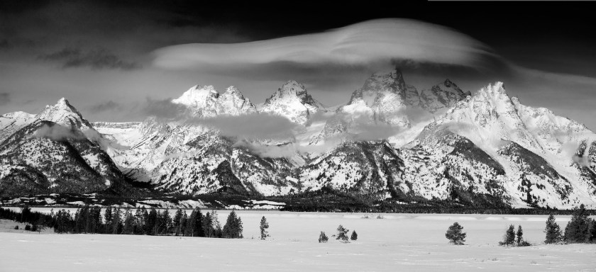
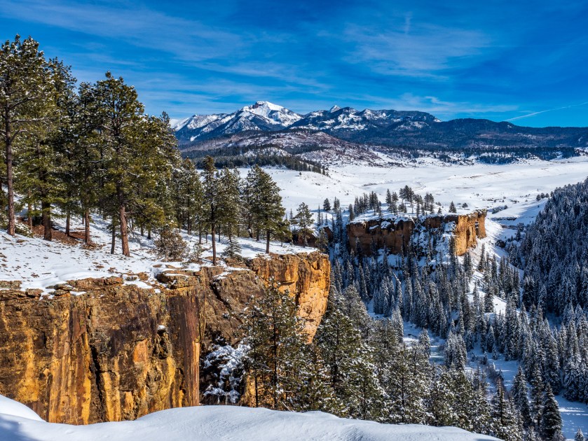
Given how early the vernal equinox is this year, perhaps I should not have been surprised (but was, at least a little) to have 7 inches of new snow on the first day of spring. That’s the heaviest single snow fall we’ve had, at our house, during this somewhat dry winter! It was just a little reminder that here in the Rocky Mountains, spring doesn’t always pay strict attention to the calendar. Still, this is a good time for a post about spring photography.
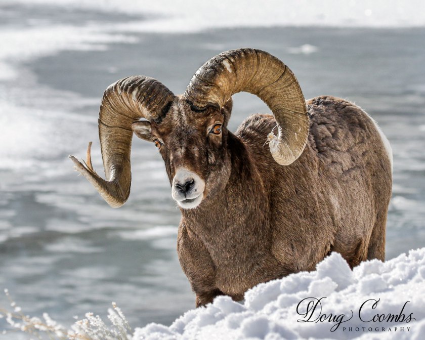
Although we have many great opportunities for landscape and nature photography in the winter here in the southern Rockies, there is no question that the new life associated with Spring makes it a joy to photograph this time of year. The grass is green, one of the most evocative colors for humans. Birds and mammals are migrating. Flowers are beginning to bloom. And, given our altered way of life in the era of COVID-19, it is fortunate that there is still a lot of photography that we can do locally, often in our own backyards, this time of year
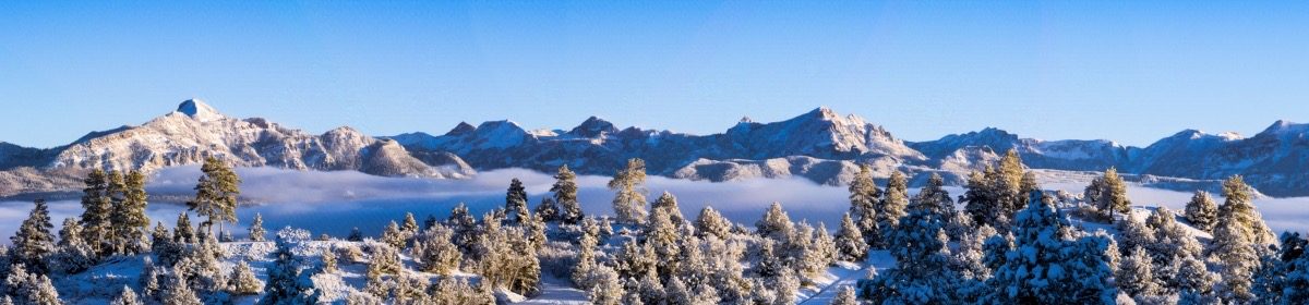
In a recent video, Photo Tom explores 9 tips and ideas for spring landscape photography. It’s worth watching to revisit some ideas for the season. One that I think is big, is to look for the transition time between seasons. The snow this week may present opportunities for photographing the contrast of flowers, for example, in snow. Other ideas include taking advantage of the bright green of spring foliage, weather patterns, and foggy mornings. Check the forecasts for the day after storms move through. Cool mornings after a storm will likely produce fog in the valleys, especially around our hot springs. Fog creates opportunities for interesting, moody photos. If you are on a ridge above valley fog, you may have a dramatic sunrise. Later in spring, as the snow melts from the high country, waterfalls and streams will be flowing strongly, making for excellent photographic opportunities. For more ideas about spring subjects, as well as composition and lighting tips to take advantage of them, check out this post by Larry Price.
Of course, one of the highlights of spring are the blooming flowers. Anne Belmont is a creative flower photographer, and shares a number of good ideas for unique, artistic flower photos in a two part series. These articles are full of ideas, including seeing flowers uniquely, and suggestions for creative aperture and composition. When thinking about flowers, as well as other spring subjects such as butterflies, you’ll want to think Macro. Macro photography is easily done in your own back yard (or even inside) and can be very rewarding in terms of training your eye to see textures and patterns Lee Hoy has some good suggestions for getting started .
There are plenty of subjects worthy of a photographer’s attention in the spring. So take advantage of the season to practice your photography, but be safe about it!